You are using an out of date browser. It may not display this or other websites correctly.
You should upgrade or use an alternative browser.
You should upgrade or use an alternative browser.
Indiana Jones and the Smoking Mirror
- Thread starter tocksic
- Start date

The great Martin Schlierkamp has finished his cover art for my book! ") I love it so much! The next step for me will be to make a final layout out of this, with Logo, Text, etc.
I love it so much! The next step for me will be to make a final layout out of this, with Logo, Text, etc. 

I love it so much! The next step for me will be to make a final layout out of this, with Logo, Text, etc.

JuniorJones
TR.N Staff Member
Stunningly nice.
EddyW said:Fantastic! Would you mind sharing a more high res version of the artwork?
When the project is wrapped, Martin (the artist) and I will provide a zip-file via download containing the artwork and the cover both in higher resolution.
indyclone25
Well-known member
be nice to get, even if i won't be able to read it .
After all we decided to share the artwork right now, so no one has to wait till the project is wrapped.EddyW said:Fantastic! Would you mind sharing a more high res version of the artwork?
You can download the cover in different variations including German and English title here: http://indyroman.blogspot.com/p/download.htmlPlease everybody downloading it mind the README file provided with the pictures!


Indy's brother
New member
Awesome touch, Tocsic! (Crossing my fingers for that english translation....I only know about 5 words in German)
ResidentAlien
Guest
Tocksic, please don't take this the wrong way. I really, really love the artwork and wish I could read the novel (I've my fingers crossed for an English translation). However, I just don't like the current layout of the cover. Consider this constructive criticism and not a slight against you or your work. I just feel your name is way too prominent on the cover. I'm not trying to diminish you or your work, but it's just a matter of aesthetics. Pretty much any Indy poster or book cover more prominently features the name of the character. I think that makes more aesthetic sense too since that's the real draw and what you want the viewer's eye to engage on.
I created a few alternate covers real fast in Photoshop to illustrate my point.

Anyway, again, really really impressed with the work you've shared so far. Just thought I'd offer my two cents..
I created a few alternate covers real fast in Photoshop to illustrate my point.
Anyway, again, really really impressed with the work you've shared so far. Just thought I'd offer my two cents..
Last edited:
@RA: I know what you mean, but on the other hand there was a plan behind the cover art. The layout was meant to be the close to that one ToD Poster. Where the Logo is on the lower left.
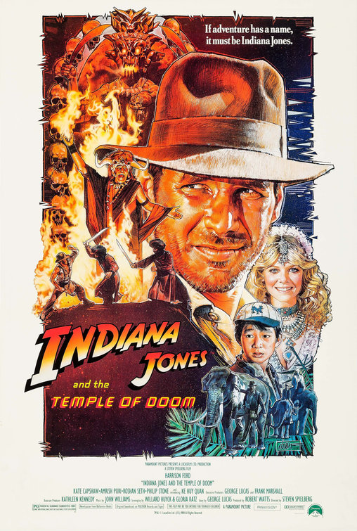
If you watch the Smoking Mirror cover you will see that those rocks on the lower left desperately need the logo on it, else there is to much space where "nothing is happening", which would be a big design fauxpas. And to make the name on top smaller is no good idea to, because it would cause an imbalance in the header. I'm sorry I can't explain that better, because my English is to limited for that.
But I really appreciate your feedback!
If you watch the Smoking Mirror cover you will see that those rocks on the lower left desperately need the logo on it, else there is to much space where "nothing is happening", which would be a big design fauxpas.
And to make the name on top smaller is no good idea to, because it would cause an imbalance in the header. I'm sorry I can't explain that better, because my English is to limited for that. But I really appreciate your feedback!
ResidentAlien
Guest
tocksic said:@RA: I know what you mean, but on the other hand there was a plan behind the cover art. The layout was meant to be the close to that one ToD Poster. Where the Logo is on the lower left.
If you watch the Smoking Mirror cover you will see that those rocks on the lower left desperately need the logo on it, else there is to much space where "nothing is happening", which would be a big design fauxpas
But I really appreciate your feedback!
I know exactly what you mean about the dead-space, but I tried to mitigate that by placing your name there.
Montana Smith
Active member
tocksic, I have to agree with RA.
Your artwork is incredible. RA's repositioning and re-sizing of your name and title make the artwork appear to flow more comfortably. The traditional colours of the Indy logo sit more naturally above the image. Despite your creative talents, Indiana Jones is the main attraction, and should be the first words the reader sees. From then the eye travels down the image, until finally discovering the creator's name.
As RA wrote, it's just a matter of aesthetics.
EDIT: I don't see a problem with the blank space of the rocks, as long as your own name goes there. It has the effect of guiding the eye diagonally from Indy's face, through the other characters (along the line of Indy's swinging feet), to the galloping horse.
I get the thing with the name. Maybe I try to rework something there. But being a professional graphic designer for a decade, I have to strongly disagree with the idea of taking the logo on top and letting the rocks be an element of their own in the composition - only covering them with a small name. My old instructor would rip my head of.
But I will reconsider the ration of name/logo and post a new version when it's done.
edit: Maybe I have another idea how the logo could go on top but not leaving the rocks naked. Stay tuned.
But I will reconsider the ration of name/logo and post a new version when it's done.
edit: Maybe I have another idea how the logo could go on top but not leaving the rocks naked. Stay tuned.
Last edited:
Montana Smith
Active member
tocksic said:edit: Maybe I have another idea how the logo could go on top but not leaving the rocks naked. Stay tuned.
Place your name like this?
ROBERT
ANDERSEN
That would fill the rock space, without cutting across the other artwork.
Montana Smith said:Place your name like this?
ROBERT
ANDERSEN
That would fill the rock space, without cutting across the other artwork.
Like we would share one brain!
I just have to find the right fonttype that matches this position. Montana Smith
Active member
tocksic said:Like we would share one brain!
I wish we shared the same language, too - as I'll have to await the English translation of Smoking Mirror!