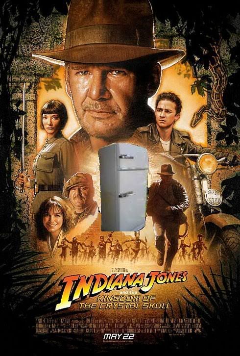
Second Official Poster Released!

Indy_Chic

New member
replican't said:
They coulda made it much, much better!

untitled.jpg


:D LMAO!!!! I'm so glad the fridge is featured on the poster, I was worried that it might have been forgotten. ;)


On a side note - Indy has facial hair in the poster! ;)
 

The Man

Well-known member
Beautiful. It could be 1990. Perfectly consistent.(y)
The party-crashing snake is cool also...
 
Last edited:

Playmount

Member
Something doesn't look right...

It feels... okay to me. I like it, but I don't love it. Somehow I think the original artwork Struzan may have turned in was better. Or, at least... I hope so. It seems, I don't know... majorly 'effed with by some Photoshop lackey at Lucasfilm. Just like Struzan's Episode III poster.

Some or all of the foliage looks like it was added later, especially at the top of the poster where it is completely black and there is no fine, penciled-in detail (it may just be the jpg compression, though)... the blurred foliage against the yellow/orange background next to Indy's head looks added and bizarre (what's the motivation for it?)... the left side of Indy's hat still retains a golden feathered outline suggesting the real yellow/orange background used to extend everywhere around his head... and the crystal skull feels completely out of place, like it has been added in over a typical Struzan sun disc (like on his Last Crusade poster). Compare the crystal skull here to the way Struzan depicted it on the teaser poster. It just doesn't look like his work. To me, anyway.

Hard to tell though due to the sloppy, pixelated, nearest-neighbor reduction of the image that USAToday did. I mean, look at the credits!

All this endless digital tinkering (if that's what it is -- I have no proof) is really sapping this modern-day Lucasfilm stuff of the inspired, handmade look the 80s stuff seemed to possess in abundance.

At least they didn't mess with Struzan's near-superlative depiction of Ford. Much better than the teaser poster depiction. For Struzan, I'd place it just after his Temple of Doom depiction and before his Last Crusade. Also... Ford running looks like it was taken from Raiders. Notice his bag strap -- it's underneath his jacket!
 
Last edited:

Indie House

New member
And to everyone that got their panties in a bunch over the style change to the font can rest easy... the 'old' font is back...

:hat:
 

Blue Jay

Member
i am not sure, but i think indy is wearing his bag strap under his jacket in this depiction, LOL

...or it is just the low res, i am not sure.
 

Darth Vile

New member
I think it's a solid poster. Funnily enough, it seems closer in feel to the Star Wars prequels than to Raiders, TOD and LC... but I think that's more to do with the way the art work is actually done these days.

Better than TOD final poster, but not as good as Raiders or LC (IMHO).
 

NamedAfterDaDog

New member
I love this poster!!
Buy something doesn't feel right when I look at it. It just doesn't look as captivating as the others. Like RotLA's poster, or better ToD's poster sucked you in, and you're thinking "Who's that bad guy, or why does Indy look like that, or who is that girl," etc.
But this one, it just kinda feels like it's Harrison Ford's and the rest's photos just digitally.... put there. I don't really know how to put it, it just looks like a cheap poster, not his best work.
Great, still, don't get me wrong, I love it! On the wall like the other ones! :whip:
 

Rhys135

Active member
It's fantastic. It really has a classic feel to it, and sit's comfortably next to the other posters.

Cannot wait to buy it!
 

Darth Vile

New member
NamedAfterDaDog,

Which TOD poster do you refer to? I thought the teaser for TOD was classic, but final release poster was poor. The TOD poster that ended up on subsequent video and DVD covers, IMHO, looks like a comic book. I'd be intersted to know if you have a different version...
 

Zorg

New member
Well that poster is just.... SWEET! Beautiful. Very cool. Very nice. That's the way an Indy poster should be. We got two beautiful Indy posters for KotCS, and that is just wonderful. Like it needs to be said, but... Struzan doesn't disappoint.
 

foreignerfred

New member
Like I've been explaining to my lesser-Indiana-Jones-fans friends when I try to help them understand what they're seeing: This is what will be on the DVD cover, the CD cover...and my pillow cover.
 

martinland

New member
No Ticket said:
The second was the whole "If adventure has a name, it must be Indiana Jones."
The teaser poster simply stated: "Trust him."
I like that even better as an ultra short tagline ... ;)
 

deckard24

New member
Playmount said:
It feels... okay to me. I like it, but I don't love it. Somehow I think the original artwork Struzan may have turned in was better. Or, at least... I hope so. It seems, I don't know... majorly 'effed with by some Photoshop lackey at Lucasfilm. Just like Struzan's Episode III poster.

Some or all of the foliage looks like it was added later, especially at the top of the poster where it is completely black and there is no fine, penciled-in detail (it may just be the jpg compression, though)... the blurred foliage against the yellow/orange background next to Indy's head looks added and bizarre (what's the motivation for it?)... the left side of Indy's hat still retains a golden feathered outline suggesting the real yellow/orange background used to extend everywhere around his head... and the crystal skull feels completely out of place, like it has been added in over a typical Struzan sun disc (like on his Last Crusade poster). Compare the crystal skull here to the way Struzan depicted it on the teaser poster. It just doesn't look like his work. To me, anyway.

Hard to tell though due to the sloppy, pixelated, nearest-neighbor reduction of the image that USAToday did. I mean, look at the credits!

All this endless digital tinkering (if that's what it is -- I have no proof) is really sapping this modern-day Lucasfilm stuff of the inspired, handmade look the 80s stuff seemed to possess in abundance.

At least they didn't mess with Struzan's near-superlative depiction of Ford. Much better than the teaser poster depiction. For Struzan, I'd place it just after his Temple of Doom depiction and before his Last Crusade. Also... Ford running looks like it was taken from Raiders. Notice his bag strap -- it's underneath his jacket!
I'm guessing this poster will grow on me like the teaser one, but something still feels very off about them both! I'm really strongly suspecting some digital assistance for Struzan, and that these last two posters may have not been done completely by hand. Ford looks great, but you can tell Struzan shaved off a bunch of years in that portrait. The foliage and stonework of the ruins bordering the picture is very graphic looking, almost video game like, which to me hints at some photoshop work. I pulled out my two Struzan poster books and flipped through all his Indy work, and there does seem to be something different about these as compared to his older works. I didn't see it with the Star Wars posters, so I'm wondering if it's something new he's trying?

I'm just not as pumped as I'd hoped I be! The TOD poster to me is Struzan's best Indy work by far, and none of the posters since then have come close to it. I do like this poster, but to me it's in the same league as the LC one- sheet.
 

bergstrom

New member
I have to admit the teaser poster was better than this. This has been "interfered" with. Isn't it an insult to Drew Struzan if u tinker with his work George!!

Berg
 

Echo22

New member
Love the Poster - very traditional. The way it should be.

I laugh every time I look up towards the upper left corner and see that smiley face in the stone. Who is that guy? :D

Great salute to the previous posters. Also very Star Wars, Harry Potter esque.

Less than 2 and a half months, folks.
 
Top