You are using an out of date browser. It may not display this or other websites correctly.
You should upgrade or use an alternative browser.
You should upgrade or use an alternative browser.
indiana jones fonts
- Thread starter Redskull
- Start date

Vance
New member
I-Jones said:Does someone knows the "Property of Dr Jones" font they use on the crate?
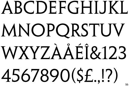
Look up 'Stencil'. It's one of the old military-style stencil fonts. From that, though, I can't tell which.
Vance said:Look up 'Stencil'. It's one of the old military-style stencil fonts. From that, though, I can't tell which.
Thank You
")
Ska
New member
***update***
For anyone still looking for the opening credit fonts for Raiders...
I found some free fonts to download:
For the "RAIDERS" part of the title, use the "Village" (called "Prisoner" on the website, but downloads as "Village") font found here:
http://www.dafont.com/prisoner.font
For the "OF THE LOST ARK" Part of the title, use the "Acens" font found here:
http://www.dafont.com/acens.font
That's the best I can find...Acens seems pretty accurate...while Village is missing the outline. Friz Quadranta is without the outline, also.
Vance said:Well, doing a font lookup...
It's FritzQuadrata from BitStream (stylized a little), which, sadly, isn't a free font. I don't know if there's a clone of it.
For anyone still looking for the opening credit fonts for Raiders...
I found some free fonts to download:
For the "RAIDERS" part of the title, use the "Village" (called "Prisoner" on the website, but downloads as "Village") font found here:
http://www.dafont.com/prisoner.font
For the "OF THE LOST ARK" Part of the title, use the "Acens" font found here:
http://www.dafont.com/acens.font
That's the best I can find...Acens seems pretty accurate...while Village is missing the outline. Friz Quadranta is without the outline, also.
VP
Moderator Emeritus
I prefer Open Capitals for the title and Eurostile for the subtitle.
http://www.myfonts.com/fonts/artypes/open-capitals/familytree.html
http://www.myfonts.com/fonts/linotype/eurostile/
http://www.myfonts.com/fonts/artypes/open-capitals/familytree.html
http://www.myfonts.com/fonts/linotype/eurostile/
Short Rounded
New member
Color
No I am not making this up... in Microsoft Word, type Indiana Jones in the font called SF Fedora. Then do the WordArt that matches the slant the closest. Then, right click on the text and do Format Word Art. Then click the color blue arrow on the side of the color bar and clisck fill effects. Once on that screen, click two colors. Then you can choose yellow and orange. Hope this helps!
No I am not making this up... in Microsoft Word, type Indiana Jones in the font called SF Fedora. Then do the WordArt that matches the slant the closest. Then, right click on the text and do Format Word Art. Then click the color blue arrow on the side of the color bar and clisck fill effects. Once on that screen, click two colors. Then you can choose yellow and orange. Hope this helps!
Short Rounded said:No I am not making this up... in Microsoft Word, type Indiana Jones in the font called SF Fedora. Then do the WordArt that matches the slant the closest. Then, right click on the text and do Format Word Art. Then click the color blue arrow on the side of the color bar and clisck fill effects. Once on that screen, click two colors. Then you can choose yellow and orange. Hope this helps!
That's true, of course, but do you notice when the question was asked?
Last edited:
Lance Quazar
Well-known member
Blown383 said:Great font! Now how do I get the correct color shading on the text in photo shop?
-B
I'd love an answer to this, too. I'm a photoshop amateur and I got kinda sorta in the ballpark, but far from an exact match.
Any help, folks?
p.s. - Vance, I had no idea you created those fonts! Bravo and thanks!
Short Rounded
New member
I don't look at the date the post was posted. But other people might be looking for an answer and stumble upon it...Attila the Professor said:That's true, of course, but do you notice when the question was asked?
Goonie
New member
Ska said:
Does anyone have this "SF Fedora Titles" zip file? I tried saving it and unzipping it, but I got an error each time I tried. The error I get is "Unexpected end of archive."
Edited: Ok nevermind. I opened the file rather than saving it. By opening it rather than not saving it, I managed to unzip it.
VP
Moderator Emeritus
I just recreated the Raiders title in high-res and thought maybe someone is interested in the fonts used.

For RAIDERS I used the free font Caeser Open.
For OF THE LOST ARK I used the free font Microgramm:
Those two fonts are just look-alikes! They ain't the real ones used in rotla, lc and kotcs. For OF THE LOST ARK they originally used a font called "Eurostile Extended 2", but that one ain't for free. I used to know the original font used for RAIDERS, but I forgot and can't find the website where I read it.
VP
Moderator Emeritus
That's inaccurate. Here's my version: http://users.metropolia.fi/~villerep/raiders_logo/raiders_logo2.png
And a comparison with the original, O stands for Original and VP is the one I recreated.

And a comparison with the original, O stands for Original and VP is the one I recreated.
indyfan85
New member
Vance said:*sigh*
SF Fedora is a pirated version of my font 'Adventure' (www.pixelsagas.com/fonts) , right down to the choices used for international and special symbols. That's why I can't stand them... bunch of credit-stealing thieves.
The secondary font, ("Temple of Doom" text) I have on my site as 'Adventure Subtitles'.
For the intro screen...
I'm not sure what "Raiders" is there. It looks like a stylized version of a stock font, though.
"Of the Lost Ark" is Microgramma Extended.
Just wanted to say thanks for making the fonts Vance, I used them recently for a few videos on my youtube page.
VP said:That's inaccurate. Here's my version: http://users.metropolia.fi/~villerep/raiders_logo/raiders_logo2.png
And a comparison with the original, O stands for Original and VP is the one I recreated.
Excuse me that mine ain't perfect! Geeeez! I was just foolin' around with it and did not claim that it's "accurate".
BTW: I mentioned the thing because of the look-alike fonts - because I thought someone could find them handy sometime.
TheIndyOpinion
Member
tocksic said:Excuse me that mine ain't perfect! Geeeez! I was just foolin' around with it and did not claim that it's "accurate".
BTW: I mentioned the thing because of the look-alike fonts - because I thought someone could find them handy sometime.
Thanks for posting it, tocksic. Those are good close enough fonts, and I appreciate it as I will use them for the opening titles in the next lame little fan film that my father-in-law and I put together.
VP said:That's inaccurate. Here's my version: http://users.metropolia.fi/~villerep/raiders_logo/raiders_logo2.png
And a comparison with the original, O stands for Original and VP is the one I recreated.
Man, thats spot on! Did you find a font online that matched it, or did you have to photoshop an existing one to get to that? Either way it's pitch perfect.
Laserschwert
Member
Faleel said:Aparrently, the font that should be used for that is called: Penumbra
I doubt that:
The R isn't rounded at the tail, the A doesn't have a tilted apex, plus its crossbar is lower, and the S has vertical serifs.