Janusz Kaminski vs. Douglas Slocombe

DarthLowBudget

New member
lostworld.jpg


This shot is from The Lost World, cinematography courtesy of Mr. Kaminski, and looks quite "normal". I'd say that Indy 4 is in fine hands.

Further "normal looking" shots by Kaminski:

Teary13w.jpg


09catchme.jpg


amistad4.jpg


07235-4.jpg
 

Playmount

Member
commontone said:
If Kaminski is using his "usual diffusion filters," what exactly does that mean?

Like someone mentioned above, many of Spielberg's recent movies seem to have muted, desaturated color. Is that due to these filters? It was a nice effect for films like Saving Private Ryan and Minority Report, but wouldn't at all be appropriate for Indy, IMO.

I don't know much about photography, but it seems a bit gimmicky. Kind of like if a mixing engineer detuned all the music he mixed by 4 cents, to give it his "personal touch" or something.

The desaturated look you're referring to isn't related to the use of filters on the camera during main production. What you're referring to is known as "skip bleach" or "bleach bypass." It's where, during processing of the film negative back at the lab, they skip or reduce the amount of bleach used, thus leaving a greater amount of silver halide crystals (the tiny particles of "grain" that make up the image) along with the red, green and blue color dyes on the emulsion. This results in a B&W image on top of the color image.

So you get a desaturated, contrasty, grainy look.

The filters that Mullen was talking about would only add a softer, hazy effect -- and some "blooming" on light sources. Remember the scene with the grail knight in Last Crusade? Remember how it was kind of hazy, dreamy looking?

Look at the blooming effect of the light sources & reflections here:

374.jpg


379.jpg


This look can also be achieved with atmospheric effects like smoke.
 

Kingsley

Member
Playmount said:
It's the familiar "Filmed in Panavision" look.
Nice examples!!
I think Kaminski knows Indiana Jones has its standard, a high standard set by Slocombe. And he will do his best to fill those shoes... actually, he did (they probably filmed all by now)
 

Vendetta08

New member
Thanks for the film lessons Playmount(y)


I expect they will keep consistency with the other films. I don't want Indy 4 looking all gritty and dark like War of the Worlds and Munich.
 

VP

Moderator Emeritus
So are they shooting Indy 4 in the traditional 2.35:1 anamorphic or the wider 2.40:1 anamorphic you mentioned earlier?
 

-Jones-

Member
Don't worry people ;). Kaminski knows his job and he will do it right. Besides, his is my countryman ;). 2 Oscars for something, not for nothing ;).
 

Playmount

Member
VP said:
So are they shooting Indy 4 in the traditional 2.35:1 anamorphic or the wider 2.40:1 anamorphic you mentioned earlier?

2.35:1 has actually been 2.40:1 ever since SMPTE changed it in 1970. They made the height of the film frame slightly smaller to better hide splices. The new aperture size on anamorphic 35mm film is 0.838 in by 0.7 inches (1.19:1). So it's actually closer to 2.39:1 after the 2x anamorphic stretch out, believe it or not... which just makes the whole thing even more complicated, right? :D

People still say 2.35:1 (two three five) even though they really mean 2.40:1 (two four oh). The Indy films on DVD are actually a fairly poor transfer if you measure the aspect ratio. I think I remember them measuring around 2.20:1.:(
 

Playmount

Member
Playmount said:
I think I remember them measuring around 2.20:1.:(

Correction: Make that 2.30:1! You'll notice that the DVD image has slight black "pillar bars" on the left and right. If they weren't there, the DVD aspect ratio would have been around 2.32:1... which is still not quite right. (n)

As I said, it should be closer to 2.39:1. Oh well... maybe they'll finally get it right on the Blu-Rays.

indyaspectzk1.jpg
 

VP

Moderator Emeritus
So they shoot at 2.40:1 and after cropping the black areas from the sides it becomes 2.35:1? Or what?
 

Playmount

Member
More Confusion

VP said:
So they shoot at 2.40:1 and after cropping the black areas from the sides it becomes 2.35:1? Or what?

Sorry to confuse you, no... that image from the Raiders DVD above and the tiny black bars you see demonstrate an anomaly only with the DVD transfer and has nothing to do with how the movie was shot.

Just to clear things up (hopefully :) ):

  • The Indy Trilogy DVD set is presented slightly cropped at the sides resulting in a 2.30:1 aspect ratio (the visible picture area).
  • If you measure the full DVD width, (including the tiny black bars) it still only gets you to 2.32:1.
  • All four Indy movies were photographed at 2.40:1 (actually 2.39:1).
  • 2.35:1 was standard before 1970. 2.40:1 became the new standard after 1970. The reduction in image height (not width!) of the exposed area on film was to better hide film splices.*
  • Anamorphic "Scope" films have always used a 2x distortion lens. The various changes in aperature size over the years (1.33:1; 1.27:1; 1.17:1; 1.19:1) have resulted in four "Scope" theatrical aspect ratios respectively:

    1953-1954: 2.66:1
    1954-1957: 2.55:1
    1957-1970: 2.35:1
    1970-present: 2.39:1

*There was an infinitesimal change of the 35mm aperture dimensions in 1993, but the "Scope" aspect ratio stayed the same on film, namely: 1.19:1. So at the theater, you get 2.39:1 with a 2x anamorphic lens.
 
Last edited:

VP

Moderator Emeritus
So when I take screenshots with PowerDVD and they aren't automatically stretched back from the anamorphic state should I stretch them to 2.30:1, 2:35:1 or 2.39:1 cropped?
 

Playmount

Member
VP said:
So when I take screenshots with PowerDVD and they aren't automatically stretched back from the anamorphic state should I stretch them to 2.30:1, 2:35:1 or 2.39:1 cropped?

Well, TheRaider.net's 2.35:1 screenshots look great regardless, even though "technically" you could argue that some of the available picture information is lost by a small amount of photo-manipulated cropping... if you wanted to preserve the maximum amount of image area as presented on DVD, then you would have to go to 2.30:1 because that is all that is there on DVD.

The extra .09 at the left and right isn't being shown to us... where it would have been is beyond the edge of the DVD frame. Think of it as if they are slightly zooming into the original film frame by about 4%.
 

VP

Moderator Emeritus
Ah ha, so they shoot at 2.39:1 and then enlarge the picture for what ever reason for the DVD? Fascinating information, thanks for sharing. :hat:
 
Philip French salutes the great cinematographer, honoured last week at a Bafta event

Last week leading figures in British and American cinema turned out to take part in a Bafta tribute to the great cinematographer, Douglas Slocombe, 97 this coming February.
VARIOUS-001.jpg

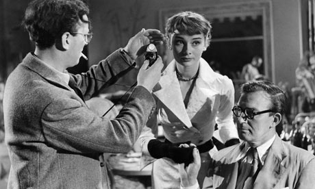
Douglas Slocombe, left, checks light levels with Audrey Hepburn on the set of The Lavender Hill Mob, 1951. Photograph: Everett Collection / Rex Features

At the age of 10, he met James Joyce in Paris when the novelist dropped around with a pre-publication copy of Ulysses for Dougie's bohemian parents, and his career ranges from covering the German invasion of Poland in 1939 as a combat cameraman (he is on his way home via Stockholm with his previous footage) to shooting all three Indiana Jones movies on exacting locations in the 1980s. From the early war years, Dougie was a leading photographer at Ealing, working in a variety of modes, from the macabre Dead of Night through the ultra-realist It Always Rains on Sunday to the iconic comedies Hue and Cry, Kind Hearts and Coronets and The Lavender Hill Mob.

After Ealing he shot the Cliff Richard musical The Young Ones, John Huston's Freud: the Secret Passion and Joseph Losey's The Servant, collaborating intimately with the directors in determining their individual styles, confirming his reputation for imagination, visual flair and dramatic composition, as well as becoming celebrated for his wit, modesty, generosity and calming influence on the set. A film of his appears in almost everyone's 10 best lists, whether it be for something as obscure as Losey's Boom! or the cult success The Italian Job.

Stories about him abounded. In his tribute, Harrison Ford claimed that Dougie never used a light meter – he just held up his hand and observed the shadow his thumb made on the palm. Vanessa Redgrave spoke of the wonderful way Dougie shot her father as a mad ventriloquist in Dead of Night, and the flattering way he lit her and Jane Fonda in Fred Zinnemann's Julia. Glenda Jackson recalled an overhead shot in which Dougie photographed her stark naked on the floor of a rocking Russian train in Ken Russell's The Music Lovers. When, after a brutal third take, he dropped on top of her from the luggage rack, he said, in his charming stammer: "I'm a m-married m-man."

At the end, Slocombe, owner of one of the great eyes in movie history but now nearly blind, thanked Bafta for honouring him and the NHS for making his appearance there possible.
 

Raiders90

Well-known member
Cinematography in KOTCS vs the original trilogy

Does anyone else think that the cinematography in the original 3 Indy films help create/capture the "feel" or atmosphere of the periods they're set in? In the original 3 movies, it certainly does feel like we're in the 1930s--It works very well as a period piece beyond being just an adventure film. Beyond that, the characters act and are mannered as people in the 1930s would be--They talk much more proper and are better mannered; The original 3 (especially LC) have a very warm, saturated, look to them.. ROTLA is very well lit and gritty; It really feels like you're in an ancient, dirty, dusty, temple. LC has a bit of a different look, having an almost technicolor look to it--like the color films of the late 1930s, an almost comic book color tone to it--very lively, very eye catching. They just feel like real period pieces, a real look into that particular period of time.

In comparison, a series like the Mummy series, which, like IJ are period films (set from the '20s to the '40s) don't really feel like they're period films. The way the characters act and even in some cases, dress, feels like they could be put into any time period and they'd fit. Perhaps it's just because Rick O'Connell lacks the class Indy has, I don't know, or it's the lighting or something. It just looks and feels very "modern."

Even the little Harrison cameo in Mystery of the Blues, set in 1950, has a very early '50s feel to it; From Indy's clothes to the villain's garb to the cars and the cinematography and the cabin; it feels almost like something out of the early 1950s. It almost looks like it was done by Douglas Slocombe

I don't know if I can say the same for KOTCS, though...Somehow the film looks VERY different from all the rest. It looks shiny, washed out, blurred like all the color has been drained from it leaving a dull mess. There's no warmth to the film's colors; no comic book sort of feel. It almost looks like a faded photograph in some ways, and I actually think the cinematography in a very subtle but major way actually helps in making KOTCS feel different from the other three--It makes it feel "alien" so to speak. The whole look of the film doesn't really "jive" with the original 3, and it makes certain things look out of place--Indy looks odd in his outfit in this movie, and it's really the lighting and whatnot that do it.

I'm not by any means a cinematograpy or film expert and maybe some here who know more on the topic can weigh in and speak about the technical aspects of this...But KOTCS LOOKS very different from the original 3 films and even from the YIJC, and it in turn gives it a very different "feel."--More like the Mummy films than the original trilogy. A little too modern looking; a little too bright; a little too well lit and washed out.
 

Darth Vile

New member
I think the lighting/cinematography in KOTCS is somewhat different to the original three. However, I think Kaminski does a reasonable job at replicating the originals e.g. the opening credits, the warehouse, the bunker, the diner, inside Akator etc.

I agree 100% that in some scenes (notably outside the warehouse, some of the jungle chase and ants and the waterfall scene) the lighting looks over exposed i.e. too much light... and you can't help but think "why have they done it like that?". I assume that this is just a bit of Kaminski's own style leaking in. Saying that, whilst you can obviously tell it's Kiminski's work, I think the lighting on KOTCS is a different as we can expect it to be from the movies you mention e.g. Saving Private Ryan, Minority Report... which are very cold, almost clinical by contrast. KOTCS seems very 'warm' (for want of a technical word) when comparing the cinematography between it and its contemporaries e.g. TDK, Iron Man, Sherlock Holmes. For me anyhow, KOTCS does seems to re-capture some of that hazy, lush lighting from 40's and 50's Hollywood cinema.

Personally speaking, I would have preferred some bolder lighting choices to make it look markably different from the other Indy movies... but overall I think it was pretty successful in achieving an 'Indiana Jones' aesthetic (if there is such a thing). ;)
 

Goodeknight

New member
The original trilogy looks much different, but it's not Kaminski's fault.

KOTCS looks like a bunch of plastic and plaster sets with cobwebs applied out of a bag. Add that to overused and badly done CG and you'll get a different look no matter who's shooting it.

indiana-jones-and-the-kingdom-of-the-crystal-skull.jpg
 
Besides the typical retread thread, the only thing that merits convesation is your certainty of opinion regarding the feel of the 30's or 50s.:rolleyes:

Janusz Kaminski vs. Douglas Slocombe

deckard24 said:
Douglas Slocombe was the cinematographer for RotLA, ToD, and LC, but has since been replaced by Janusz Kaminski who became Spielberg's go-to-guy starting with Schindler's List. I'm not a student of film or cinematography by any means, but I couldn't help but notice all of Kaminski's work with Spielberg has a grayed down bluish tinge to it. I'm assuming this is some kind of filter he uses, but the warm color saturation of the original 3 Indy movies is nowhere to be found in Spielberg's new movies. War of the Worlds, Munich, Saving Private Ryan, and Minority Report all had this look, which to me felt like the life had been drained out of the picture.

I know there's a few aspiring filmmakers here at The Raven, so what are your thoughts on Kaminski's style vs. Slocombe's? Will Indy 4 have a completely different look, or will Spielberg and Lucas guide Kaminski away from his usual style, and direct him as they see fit in order to achieve a visual continuity between the films?
..........
 
Not just thread retreads...

deckard24 said:
Douglas Slocombe was the cinematographer for RotLA, ToD, and LC, but has since been replaced by Janusz Kaminski who became Spielberg's go-to-guy starting with Schindler's List. I'm not a student of film or cinematography by any means, but I couldn't help but notice all of Kaminski's work with Spielberg has a grayed down bluish tinge to it. I'm assuming this is some kind of filter he uses, but the warm color saturation of the original 3 Indy movies is nowhere to be found in Spielberg's new movies. War of the Worlds, Munich, Saving Private Ryan, and Minority Report all had this look, which to me felt like the life had been drained out of the picture.

I know there's a few aspiring filmmakers here at The Raven, so what are your thoughts on Kaminski's style vs. Slocombe's? Will Indy 4 have a completely different look, or will Spielberg and Lucas guide Kaminski away from his usual style, and direct him as they see fit in order to achieve a visual continuity between the films?


Raiders112390 said:
I don't know if I can say the same for KOTCS, though...Somehow the film looks VERY different from all the rest. It looks shiny, washed out, blurred like all the color has been drained from it leaving a dull mess. There's no warmth to the film's colors; no comic book sort of feel. It almost looks like a faded photograph in some ways, and I actually think the cinematography in a very subtle but major way actually helps in making KOTCS feel different from the other three--It makes it feel "alien" so to speak. The whole look of the film doesn't really "jive" with the original 3, and it makes certain things look out of place--Indy looks odd in his outfit in this movie, and it's really the lighting and whatnot that do it.

I'm not by any means a cinematograpy or film expert and maybe some here who know more on the topic can weigh in and speak about the technical aspects of this...But KOTCS LOOKS very different from the original 3 films and even from the YIJC, and it in turn gives it a very different "feel."--More like the Mummy films than the original trilogy. A little too modern looking; a little too bright; a little too well lit and washed out.
 

Violet

Moderator Emeritus
THREAD MERGED.

And please, Raiders112390-use the search button before creating a new thread. The Raven's been around for a decade now- chances are, what you want to talk about, it's probably been discussed already at some point. And it's always worth checking out what others have said in the past related to the topic- you can learn something new.
 
Top