bigdaddygamer14
New member
Man I want both of those.
indyclone25 said:


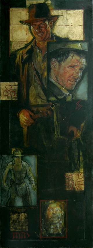
Henry said:Did you know these illustration?
I don't know what they were made for. Maybe a book cover?
jamiestarr said:http://home.scarlet.be/~bliek/drew-index-176.html
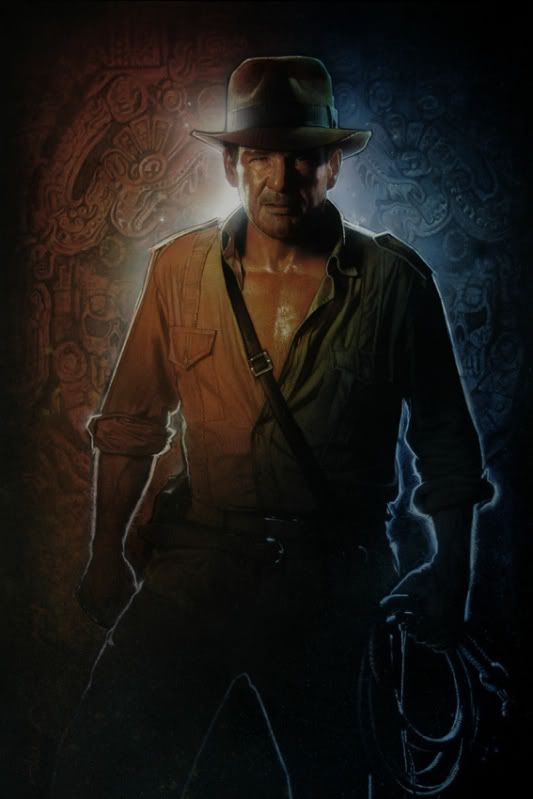
Wow. Simply one of the coolest Indy posters ever. IMO this should have been THE poster for Crystal Skull. What do you all think?
MaverickKing said:Who's the chick in the bottom drawing?
StoneTriple said:And add me to the group of people that think Struzan has Indy down to a science.

Henry said:I found this pic in the net:
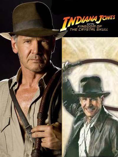
I'm curious about de pic in the right corner. Does anyone know where is it from or have a larger version?
DocWhiskey said:Nice pic, but I never understood why artists think they have to make Indy look so jolly when he's in midswing of his whip. I mean, he whips in defense/attack mode. He should look angry or determined, not like he just drank the blood of the kali.
DocWhiskey said:Nice pic, but I never understood why artists think they have to make Indy look so jolly when he's in midswing of his whip. I mean, he whips in defense/attack mode. He should look angry or determined, not like he just drank the blood of the kali.
Silvor said:Really reminds me of the stand ups from crystal skull, like this one.
http://img.allposters.com/6/LRG/22/2251/5RZZD00Z.jpg
I even think I've seen the stand up that photo is taken from, tough I'm not 100% sure of that.
What I meant was, I think I've seen the standup/photo from which the Indy in the poster is taken from. He looks like a photo in the poster even.DocWhiskey said:Well, the KotCS cardboard stand ups are made from photos. I have a ToD one that's from the poster with him holding the machete.
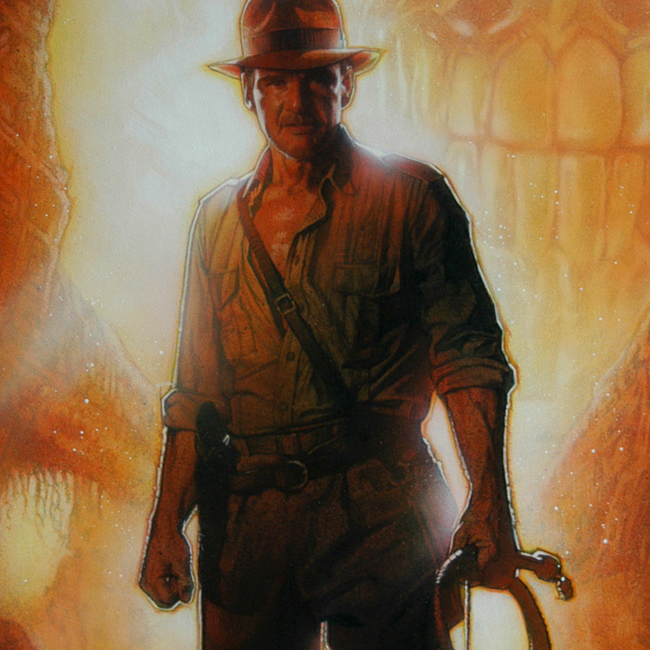
Notice how Indy's head is drastically changed in the final version. It's hard to tell from such a small picture, but I think I like the original head better actually. You can also see that the light blue details around the title are added digitally after Drew finished it.